.png)
The TDI: The Only Indicator You Actually Need

If you’ve spent any time in forex, you’ve probably seen charts that look like they belong in an air traffic control tower. Moving averages stacked on top of RSI stacked on top of MACD. Lines everywhere. Alerts firing constantly. And somehow, after all of that — still no clear answer on whether to buy or sell.
Here’s the problem: more indicators don’t give you more clarity. They give you more noise. And when you’re trading with noise, you hesitate. You second-guess. You miss the move entirely — or jump in at exactly the wrong time.
The TDI Indicator fixes that.

The Trader’s Dynamic Index is the indicator I use every single day. It’s the foundation of everything we do inside Trade Tribe HQ, and the one I teach in the TDI Mastery class. If I could only keep one tool on my charts — no hesitation, it would be this one.
Here’s what it is, how to read it, and why it works.
What Is the TDI Indicator?
The Trader’s Dynamic Index is a hybrid indicator. That means it pulls together several well-known tools — a modified RSI, a signal line, a market baseline, and volatility bands — into one clean window on your chart.
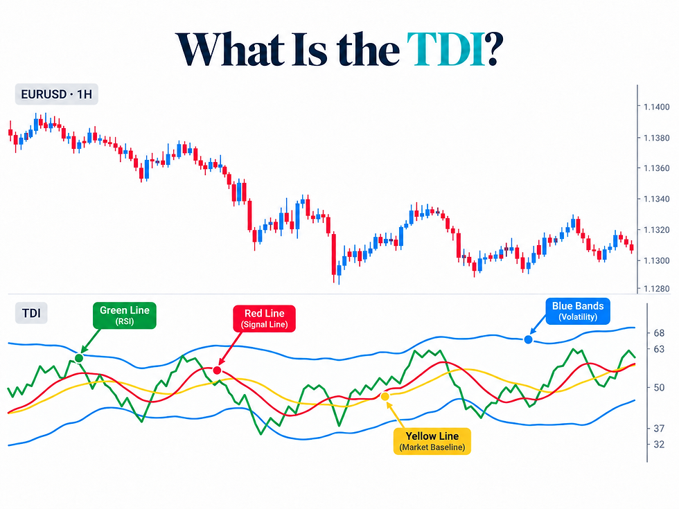
Instead of opening four separate indicators and trying to make them agree with each other, the TDI does that work for you. Everything you need to read market sentiment, momentum, trend direction, and volatility at the same time.
It was introduced by Dean Malone Beat the Market Maker methodology — BTMM. I spent two years with my nose deep in those charts, and the more time I put in, the more the TDI kept proving itself. Eventually I found I could read the dealers cycle more clearly through the TDI than through price action alone. That’s when I knew it deserved its own spotlight.

The four lines:
🟢 The Green Line — Your real-time market mood ring. Based on a modified RSI, it shows current sentiment and momentum. This is the most important line on the chart. Watch its angle closely — we’ll come back to that.
🔴 The Red Line — The smoothed signal line. It moves slower than the green. When the green crosses above the red, that’s your buy signal. When it crosses below, that’s your sell signal. This crossover is the heartbeat of every TDI strategy.
🟡 The Yellow Line — Your compass. Think of it as a live, fluid 50 EMA. Green above yellow = buyers in control. Green below yellow = sellers in control. Most traders ignore this line. That’s a mistake — it’s quietly carrying one of the most useful pieces of information on the chart.
🔵 The Blue Lines — Your volatility radar. Two lines forming a band around price action. Tight bands mean the market is compressing — coiling before a breakout. Wide bands mean it’s active and moving. When the green line breaks outside those bands, something significant is happening.
The Key Levels
The TDI is plotted on a scale from 0 to 100. Here’s what the levels mean:

50 — The midline. Above it = bullish bias. Below it = bearish bias. This is the most important level on the chart.
68 — Overbought. The market has pushed hard. Buying energy is getting exhausted. Caution on new longs.
63 — Early warning overbought. Start watching for a potential reversal before the 68 level is officially hit.
37 — Early warning oversold. Start watching for a potential buy-side reversal.
32 — Oversold. Selling energy is getting exhausted. Caution on new shorts.
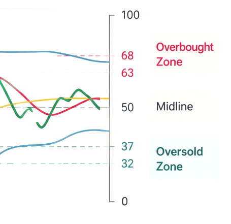
Most platforms default to showing just 68 and 32. I add 63 and 37 as well — they give you a heads-up before the market hits the official extreme, so you’re ready when the signal comes.
The Momentum Clock — Reading the Angle
This is one of the most useful reads the TDI gives you, and it requires no extra tools at all.
Look at the angle of the green line and imagine it as the hand on a clock face. That angle tells you exactly how much momentum is behind the current move.

12–1 o’clock — Strong upward momentum. Market is pushing hard. Good for long entries.
1–2 o’clock — Moderate upward trend. A potential entry if other signals confirm.
3 o’clock — Flat. No momentum. The market is going sideways. There is no trade here.
4–5 o’clock — Moderate downward trend. Consider short entries with confirmation.
5–6 o’clock — Strong downward momentum. Market is pushing hard lower. Good for shorts.
Here’s the trap most new TDI traders fall into: the green and red lines cross, and they enter — without checking the angle. A crossover without momentum is noise, not signal. If that green line is sitting at 3 o’clock, there is no trade. It doesn’t matter that the lines crossed. Wait for conviction.
“The angle of the green line is like a gas pedal. Steep angles mean the engine is running hard. Flat angles mean you’re coasting — and coasting isn’t a signal.”

What a Real Buy Signal Looks Like
Let’s walk through what a clean TDI buy setup actually looks like in practice.
Step 1 — Check the zone. The green line is above the 50 level. Bullish bias confirmed. You’re looking for longs, not shorts.
Step 2 — Check the yellow. The yellow line is rising or flat, not falling. No hidden downward current working against you.
Step 3 — Watch for the crossover. The green line crosses above the red line decisively — not a graze, a clear cross.
Step 4 — Check the angle. The green line is traveling at 12:30–2 o’clock. Strong momentum behind the move.
Step 5 — Enter. All four conditions are met. That’s your signal.
What makes it stronger: If the green line also crosses above the yellow line in the same move, that’s the trend fully confirming. Green above red AND above yellow, with a strong angle, above 50 — that’s a high-confidence setup.
What kills the signal: A flat angle (3 o’clock). Divergence between price and the TDI (more on that below). The yellow line falling hard against your direction. Any one of these is a reason to pause or skip.

Divergence — The Early Warning System
Here’s something most traders never learn to look for — and it’s one of the most powerful signals the TDI produces.
Divergence happens when price and the TDI are telling two different stories. And when they disagree, you need to pay attention.
Bullish divergence: Price is making lower lows — falling. But the TDI green line is making higher lows — rising. Price is dropping, but momentum is actually building underneath. A reversal upward is likely coming.
Bearish divergence: Price is making higher highs — rising. But the TDI green line is making lower highs — fading. Price looks strong, but momentum is quietly running out. A reversal downward is coming.
This is the signal that stops you from entering a trade that looks good on the surface but is already out of fuel. Before every trade, take five seconds and ask: is the TDI confirming what price is doing — or is it diverging from it? That five-second check will save you from more bad trades than almost anything else.
There’s also hidden divergence (which signals trend continuation, not reversal) and triple divergence (rare, but one of the highest-probability signals TDI produces). We go deep on all of it inside the TDI Mastery Class.
The 5 Strategies
The TDI isn’t a one-trick indicator. It adapts to whatever the market is doing. Inside TDI Mastery, we trade five core strategies — each designed for a specific market condition:

Trend & Angle — The bread-and-butter setup. Crossover + strong angle in a trending market. This is the foundation.
SP Reversals — Catching major market turns when the yellow line reaches extreme territory and rolls over. Patient, high-reward setups.
TDI Hook — When the green line shoots outside the blue bands and snaps back. Fast, clean reversal signal. The Shark Fin version of this is one of my favourites — it looks exactly like what it sounds like.
TDI Squeeze — Spotting compression (tight blue bands) before an explosive breakout. These are especially powerful at session opens.
The Hidden Secret — A sharp-angle break of the blue bands from near the 50 level. Most traders walk right past this one. Once you see it, you can’t unsee it.
Each strategy is built for a different market condition. The TDI tells you which one applies — you just need to know how to listen to it.
Why I Teach This — Especially to Women
Most Trading education out there is dense. Finance-heavy language. Long-winded explanations. A tone that makes things feel harder to learn than they actually are.
I spent two years with my nose in the charts before things really clicked. A big part of what slowed me down early was how the information was presented — not the information itself.
That’s what Trade Tribe HQ is built to change. We take foundational trading methodology and make it current, digestible, and accessible — with a curriculum built specifically for women who are serious about trading and want a community to learn and grow with.
Daily trade reviews. Live sessions. Challenges. Games. And resources like this, designed to actually stick.
The TDI isn’t complicated. It just needs to be read the right way.
Ready to go deeper?
The TDI Playbook: A Trader’s Field Guide is available now on Amazon — the full breakdown of all five strategies, high-probability setups, divergence, multi-timeframe analysis, checklists, exercises, and a personal trading plan template. It’s the book you keep next to your trading desk.
And if you’re ready to trade it live with a community behind you — the TDI Mastery class is inside Trade Tribe HQ, alongside daily trade reviews, live sessions, and a group of traders like you who are all in the work together.


Comments