The Market Isn’t Random — How the Forex Market Moves
- Erica Lorrai
- Mar 31
- 2 min read

Updated: Apr 17
— You’re Just Looking at It Wrong
Most traders sit down at a chart and immediately think:
“What is price about to do next?”
I used to do the same thing.
And honestly… that question is what keeps people stuck.
Because How the Forex Market Moves isn’t something you predict.
It’s something you read.
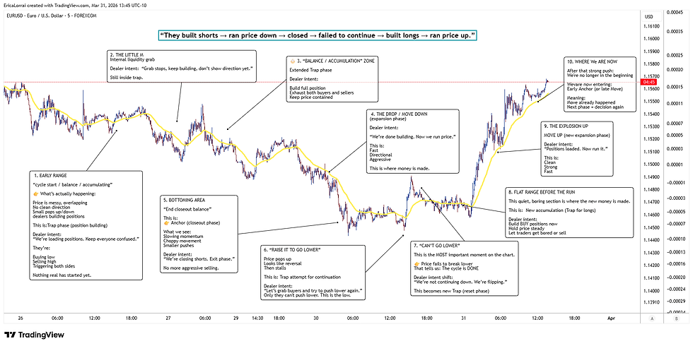
How the Forex Market Moves
What’s Actually Happening on This Chart
If you just walk this chart from left to right, the entire story is right in front of you:
They built short positions
They ran price down
They closed those positions
They tried to push it lower again… and couldn’t
They flipped direction
Built long positions
Then ran price back up
That’s it. That’s the whole move.
You dont even need indicators needed to understand it.
Just a cycle playing out.
The Only 3 Phases You Need to Understand
Everything you’re seeing breaks down into three simple phases.
Build Phase (Trap)
Where price goes sideways and feels messy.

No clean direction
Lots of overlap
Small moves up and down
What’s actually happening:
Positions are being built
Both buyers and sellers get caught
This is where most traders lose money
It’s frustrating on purpose.
Run Phase (Move)
This is the part everyone wants.

Clean direction
Strong movement
Momentum picks up
This is where price actually moves
The problem?
Most people enter here, and often too late
Exit Phase (Anchor)
This is where things slow down again.

Choppy candles
Wicks both sides
Momentum fades
Positions are being closed & the move is ending
And this is where traders often give back profits —
because they don’t realize the move is already done.
The market doesn’t go: Build → Run → Exit → DONE It goes: Build → Run → Exit → Build → Run → Exit… Over and over.
The Moment That Matters Most
There’s one spot on this chart that matters more than anything else.
Right in the middle where

Price tries to go lower… and fails.
That’s the shift.
Because in that moment:
Sellers can’t push price anymore
The downside is exhausted
and cycle is ending
And what happens next?

The market flips.
Most people make the same mistakes over and over:
Trading inside the sideways chop
Chasing price after it already moved
Not recognizing when the move is over
Basically reacting to candles… instead of understanding what’s happening behind them.
What You Should Be Looking For Instead
Instead of predicting, just slow it down and ask:
Has the move already happened?
Is price still pushing… or starting to stall?
Did it try to continue and fail?
That’s where your real information is.
The Only Question You Need
Next time you open a chart, don’t overcomplicate it.
Just ask:
Are they building?
Are they running?
Or are they done?
Once you start seeing the market this way…
it gets a lot clearer
And a lot more fun.


Comments