.png)
Bookmap EURUSD: How I see Where the Big Orders Are Waiting

What a Regular Chart Won’t Show You
A regular chart shows you where price went. Bookmap shows you where the big money was waiting.
If you trade EURUSD, that’s huge for precise entries. But Bookmap is a learning curve at first, so I’m writing this the way I wish someone had explained it to me.
Here's the problem with spot forex, which is the EURUSD you trade with your broker, doesn't trade in one central place. There's no single exchange where every order meets. When you trade, you're trading with your broker or whoever they route to. So if you pull up a spot EURUSD order book, you're only seeing that one slice of the market. It's like trying to guess the crowd at a concert by looking through one single window.
The fix is to watch the EURUSD futures contract instead, called 6E. It moves almost tick for tick with EURUSD, but it trades on one exchange (the CME in Chicago), so every order goes through the same book. That means Bookmap can show you the real resting orders and the real trades that are happening in real time. You can still place your trades on spot EURUSD. You're just using 6E as your window into what's really happening.

So what is Bookmap, exactly?
The name says it: order book plus heat map.
The order book is the list of every limit order waiting in the market. It's every buy order sitting below the current price and every sell order sitting above it, with how many contracts are at each price. Most platforms show it as a column of numbers (people call it the DOM, or depth of market) that flickers so fast you can't really read it.
The heat map is Bookmap turning that list into a picture, and keeping a record of it over time. Instead of numbers, you see colors. Bright means a lot of orders are waiting at that price, and dark means hardly any. And because it keeps the history, you can see where big orders sat, how long they stayed, and whether they got hit, pulled, or held.
This is where the big players show their hand. Retail traders are in the book too, but our orders are too small to light anything up. The bright walls that sit there and defend a price usually belong to banks and funds. A regular chart only shows you where price went. Bookmap shows you where the big money was waiting, and what happened when price got there. That's institutional order flow you can actually see.
Fun fact: Bookmap wasn't built for people like us at first. The company behind it ran high-frequency trading and built it around 2014–2015 as an internal tool to analyze its own trading. Other traders saw it and wanted it, so they turned it into a platform anyone can use (according to Bookmap's founder). Lucky us!
Bookmap is a map of Futures Contracts
Watching this map will help us immensely in our Forex spot trading.
A futures contract is an agreement to buy or sell something at a set price on a set date later on. It's standardized, so everyone trades the exact same contract on the same exchange.
It started with farmers. A wheat farmer in spring would agree to sell his harvest in September at today's price, so he knew what he'd get paid. A bakery took the other side and locked in its cost. Today, almost nobody trading futures actually wants the wheat (or the euros). Traders buy and sell the contract itself and close out before the date comes, making or losing money on the price change. Same idea as a forex position.
Don't stress if this next bit doesn't make sense to you. If you want to know more, head to this post: Futures Symbols Made Simple.
6E is EURUSD. One contract is 125,000 euros priced in dollars. It moves with spot EURUSD because it's the same currency pair.
Contracts expire. Each one has a month. The letters and numbers in the symbol tell you which one. Z6 means December 2026. Traders roll to the next contract before it expires.
The price sits a few pips off spot. Futures include a small adjustment for the interest rate difference between the euro and the dollar. It doesn't change how price moves, so you can read 6E like EURUSD and not worry about it.
ES and MES are futures too, just on the S&P 500 instead of a currency. Same concept.
Setting up 6E EURUSD in Bookmap
Open the Subscribe window in Bookmap and use these settings. Each one has a reason, and getting the symbol wrong is the easiest mistake to make (Trust me- I made it).
Setting | Choose | Why |
Platform | BookmapData | This is Bookmap's own data feed. |
Type | FUTURES | 6E is a futures contract, not spot forex. |
Exchange | CME | 6E trades on the Chicago Mercantile Exchange. |
Symbol | 6E | The plain root follows the front-month contract automatically, so you don't have to switch contracts every quarter. |
Add historical data | 7d local / 83h cloud | Loads about three and a half days of past order flow, enough to see the last few London and New York sessions. |
Tick size | 0.00005 | This is 6E's smallest price step, half a pip, worth $6.25 per contract. You see every level of the book. |
Size granularity | 1 | Shows every contract. 6E is thinner than something like ES, so you don't want small orders hidden. |
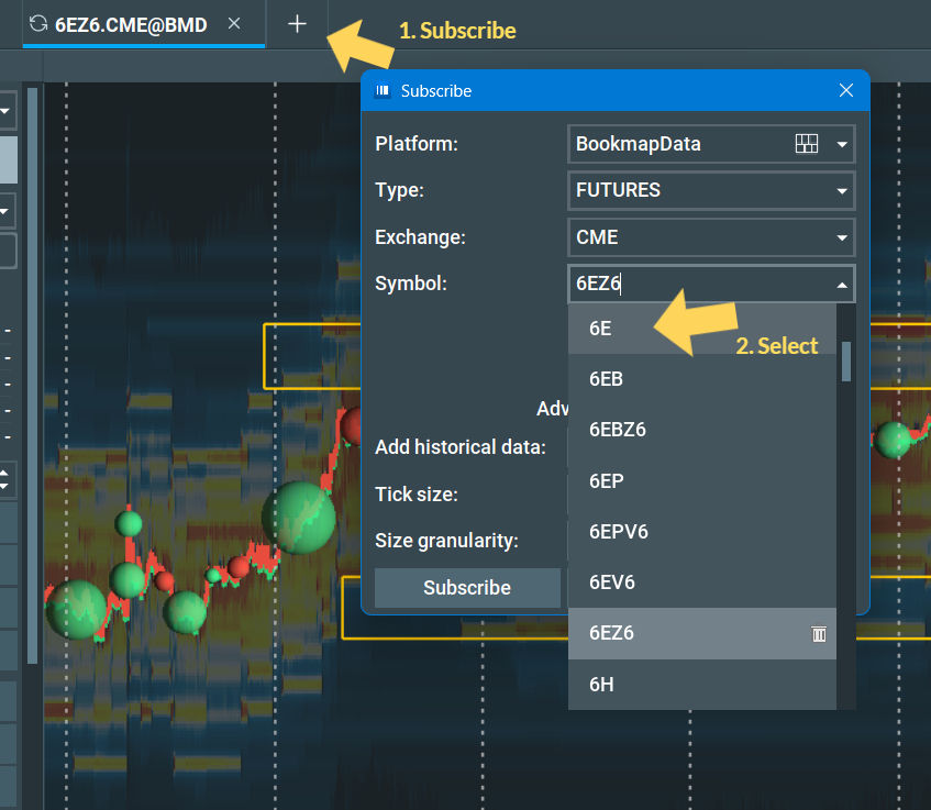
It might change when you click the 6E. In my case, it defaulted to 6EZ6 when I select 6E. Bookmap treats the plain 6E as "the main contract right now," which is the front month, the one with the most traders and volume. Right now, for me, that's 6EZ6.
For more on this head to this short post.
NOTE:
Don't type 06E. If you add a zero, the dropdown pulls up the wrong symbols. Type 6E with no zero.
Skip anything ending in V6. V means October. 6E's main contracts only trade in March, June, September and December, so the October ones barely have volume. Same goes for 6EB and 6EP. Those are different products.
Check your work. After you subscribe, the price should sit a few pips above spot EURUSD. If it's way off, you grabbed the wrong instrument.
If 6E doesn't show up at all, your data subscription may not include CME currency futures. You'd need to add that package.

How to read the screen
Now that we are all set up, let's get to reading this thing.
There are three things on a Bookmap chart: the colored background, the bubbles, and the bars along the bottom. The background shows what people are waiting to do. The bubbles show what people actually did. Most of reading Bookmap is comparing those two.
First, two kinds of orders
A limit order is someone saying "I'll buy at 1.1220" or "I'll sell at 1.1260" and waiting. It sits in the order book until price comes to it. These are patient orders.
A market order is someone saying "get me in right now at whatever price is available." It hits the limit orders that are already sitting there. These are impatient, aggressive orders. (or how we typically trade when we are watching for entries.)
Every trade is one of each meeting. Limit orders are the walls. Market orders are what runs into the walls.
The heatmap (the background)
The heatmap shows limit orders, the ones waiting in the book.
Dark blue or black means hardly any orders at that price.
Yellow, orange, red and white mean more and more orders. White and bright red are the heaviest.
A bright horizontal line means a big order, or a stack of them, sat at that price for as long as the line runs. The longer and brighter, the more it stood out.

Watch where the line is. Above the current price, those orders are sellers waiting to sell if price comes up. Below the current price, they're buyers waiting to buy if price comes down.
One catch. Orders can be cancelled before price gets there. A bright line can just vanish. That's why we don't trust a line until price gets close and we see what happens to it.
The bubbles (what actually traded)
The bubbles are market orders, people hitting the button and getting filled.
Green bubble: aggressive buyers. Someone bought at market and took the sellers' price. Buyers were in a hurry.
Red bubble: aggressive sellers. Someone sold at market and took the buyers' price. Sellers were in a hurry.
Bubble size: how many contracts traded in that moment. Small bubbles are normal traffic. A big bubble means a lot of size went through at once, often a bigger player, a big group of stops getting hit, or a reaction to news.
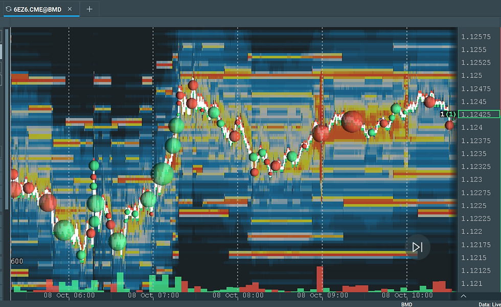
Don't just look at the color, look at what price does after the bubble.
Big green bubble and price keeps going up: buyers are winning. Sellers couldn't hold them back.
Big green bubble and price doesn't move (or drops): buyers threw a lot at it and someone soaked it all up with limit orders. That's called absorption. It usually means a big seller is defending that level. This is one of the most important things to spot.
Big red bubble and price keeps dropping: sellers are winning.
Big red bubble and price holds or bounces: a big buyer is absorbing the selling. Support is real.
A string of bubbles one color, getting bigger: momentum building in that direction.
Bubbles getting smaller and fewer: people are losing interest. Price is usually about to chop or wait for something.
Think of it like pushing on a door. Green bubbles are people pushing up. If the door swings open, price moves. If they push hard and the door doesn't budge, somebody big is holding it shut from the other side.
The volume bars (the bottom)
The bars at the bottom show how much traded in each stretch of time. Green bars mean buyers were more aggressive in that period, red means sellers were. Tall bars mean lots of activity. Short bars mean things are quiet.

You mostly use these to see whether participation is growing or fading. Tall bars on a breakout mean people are committed. A move on tiny bars is easier to reverse.
Walking through a real chart (October 8)
This is 6E from October 8. I'll go left to right, the way it happened. Times are as they show on my chart.

1. The early rally. Price climbs from about 1.1212 up to a high near 1.1257. Look at the bubbles on the way up: big green ones, one after another. The green volume bars at the bottom are the tallest on the whole chart. Buyers were aggressive and in control.

2. Rejected at the top. Right after that high, a big red bubble shows up around 1.1238. Sellers hit it hard. Price falls all the way back to around 1.1215. That's the whole rally given back.

3. A second push, but weaker. Another big green bubble around 1.1230 starts a new rally up to about 1.1250. But it doesn't get past the earlier high of 1.1257. That's a lower high. Buyers tried again and came up short.

4. The book lights up. Around the 07:00 mark, look at the background. The whole heatmap gets brighter on both sides. That usually means a session opened and bigger players showed up with their orders. The most important thing that appears is a bright orange-red line at 1.1260 that sits there for the rest of the chart and never gets tested. There's also a thick band right around 1.1250.

5. Where it is now. Price has chopped between about 1.1232 and 1.1248 for hours. The bubbles are smaller. The volume bars are short and mostly red. Fewer people are trading. Price is sitting at 1.1240, squeezed under those sellers above.
The Whole Story (October 8)

Top box, about 1.1250 to 1.1261 (sellers waiting). This holds the bright line at 1.1260, the band at 1.1250, and the morning high at 1.1257, which is where stops are likely sitting.
Bottom box, about 1.1214 to 1.1223 (buyers waiting). This holds the stacked bids around 1.1222 and 1.1217, and the morning low near 1.1215.
Notice the line at about 1.1232. This is the floor of the chop. (arrow) If price breaks below it, the bottom box is the next stop.
Anything between the boxes is noise right now. I'm not trying to trade the middle. I'm waiting for price to get to an edge and show me what it's going to do there.
The game plan: what to watch for at each edge
Bookmap doesn't tell you where price will go. It shows you how traders react when price reaches a level. So the plan isn't a prediction. It's a list of "if I see this, it means that."
If price pushes up into the top box
Sellers defend (rejection): green bubbles keep printing, but price stalls and doesn't get through 1.1250. The bright line stays lit, maybe even gets brighter. That's absorption. Buyers are pushing on a door someone is holding shut. This favors a move back down toward 1.1232 and then the bottom box.
Sellers give up (breakout): the 1.1250 band or the 1.1260 line goes dark right before price gets there (the orders got pulled), or big green bubbles chew straight through it and price keeps going. Now the path is open toward the 1.1257 high and above.
(this is current as Im writing it, so I will try to update below after the session plays out.)
If price drops into the bottom box
Buyers defend (bounce): red bubbles print, but price holds in the box and the lines underneath stay lit. A big buyer is soaking up the selling. That favors a bounce.
Buyers give up (breakdown): the bid lines vanish or big red bubbles push through them, and price keeps dropping. Sellers win that round.
The BTMM tie-in: the stop hunt
If you trade the BTMM / dealer cycle way, this chart sets up something you already know. That 1.1257 high is the obvious place for stops. Everyone who sold the top has their stop just above it, and breakout buyers have their entries there too. The second rally made a lower high, which means the market hasn't gone after that liquidity yet.
If it does, here's what it looks like in order flow: (which I will update after it happens)
Price runs just above 1.1257 with a burst of green bubbles. Those are the stops getting triggered (a stop on a short is a buy order).
Price can't hold up there. Big red bubbles show up, and green bubbles stop moving price.
The liquidity above disappears or gets absorbed, and price drops back below 1.1257 and into the box.
That's the stop hunt and reversal, the dealer taking out the stops before the real move, except now you can actually watch it happen instead of guessing. The run above the high is not your entry. The rejection after it is.
One rule I keep
A single bright line on 6E can disappear. 6E is thinner than other futures, so orders get pulled more often. I trust a level more when it stays lit as price gets close than when it was bright an hour ago.
Beginner mistakes
Watching spot EURUSD on Bookmap. You're only seeing one broker's book. Use 6E.
Picking the wrong symbol. No zero in front, nothing ending in V6. Just 6E.
Treating a bright line like a guarantee. Orders get cancelled. Wait to see what happens when price actually arrives.
Reading bubble color without reading the result. A big green bubble isn't automatically bullish. If price doesn't move after it, a seller just absorbed it, which is the opposite signal.
Trading the middle of the range. The edges are where the information is. The middle is mostly noise.
Using Bookmap to pick direction from scratch. Mark your levels first with your normal analysis. Then use Bookmap to confirm or reject what happens at those levels.
Wrapping up
This is a beginners intro, but you can become pretty dangerous with it if you can get just these few concepts. Just remember: The heatmap is what people are waiting to do, and the bubbles are what they actually did. When those two disagree, like a lot of buying that doesn't move price, that's usually where the trade is.
Set up 6E, mark your two boxes before the session, and just watch for a few days before you trade off it. You'll start seeing the walls hold and the walls fail, and it gets less overwhelming fast.
If you want to get Bookmap and set it up like mine, I wrote a post about it. Head to How to Setup Bookmap for EURUSD.
If this is how you like to learn trading, plain English, real charts, no finance-bro energy, you’d fit right in at Trade Tribe HQ. Come join us.
See you on the inside- E


Comments